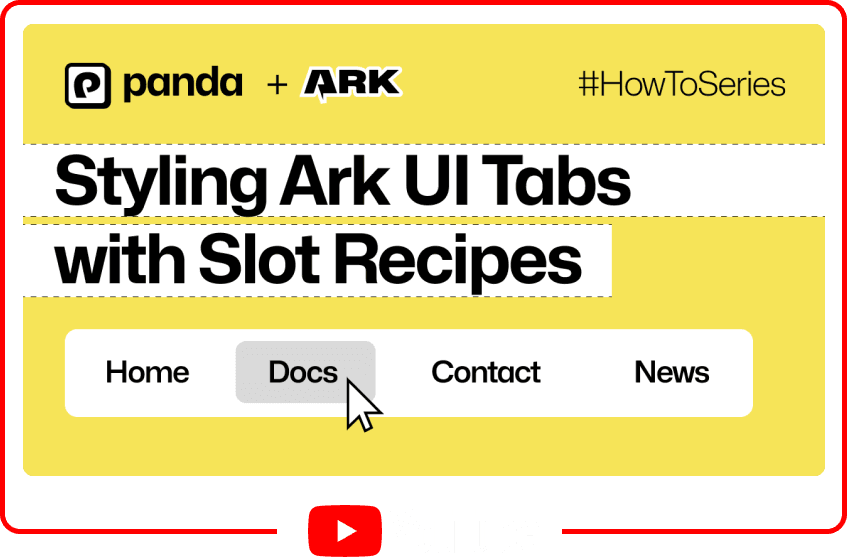
Styling Ark UI Tabs with Panda CSS
- #design-system
- #panda
- #ark
Segun Adebayo

Ark UI is headless component library that provides a rich set of accessible UI components for your design system.
In this article, I'll show how to seamlessly style Ark UI's Tabs using Slot Recipes in Panda CSS.
If you want to watch the video version of this tutorial, you can find it on my YouTube channel.
Tabs component from Ark UI
Here's the basic snippet of the Tabs component from Ark UI docs.
The component from Ark UI are compound components, which means they are made up of multiple components that work together. In this case, we have `Tabs.Root`, `Tabs.List`, `Tabs.Trigger`, and `Tabs.Content`.
It comes unstyled and we want to style it using Panda CSS, but you can use any styling library you prefer.
// components/ui/Tabs.tsx

import { Tabs } from '@ark-ui/react';

export function CustomTabs() {
  return (
    <Tabs.Root defaultValue="home">
      <Tabs.List>
        <Tabs.Trigger value="home">Home</Tabs.Trigger>
        <Tabs.Trigger value="about">About</Tabs.Trigger>
        <Tabs.Trigger value="community">Community</Tabs.Trigger>
      </Tabs.List>
      <Tabs.Content value="home">
        Write type-safe styles with ease using Panda. It's fun, fast, and easy to use. Styling
        library you'll enjoy using 🐼
      </Tabs.Content>
      <Tabs.Content value="about">
        CSS-in-JS with build time generated styles, RSC compatible, multi-variant support, and
        best-in-class developer experience
      </Tabs.Content>
      <Tabs.Content value="community">
        Join our community today. Get support, get involved and join our community of developers -
        Hop into our Discord
      </Tabs.Content>
    </Tabs.Root>
  );
}
There are two ways we could style this component:
- Apply the styling directly in the JSX using
`css()`function from Panda CSS. - Use Slot Recipes to create a reusable style recipe for the Tabs component.
Styling with `css()` function
The `css()` function from Panda CSS allows you to apply styles directly in the JSX. It's a great way to apply styles to a component when you don't need to reuse the styles elsewhere.
We'll start by creating an object of styles to hold the styles for each part.
// components/ui/Tabs.tsx

const classes = {
  root: css({}),
  trigger: css({}),
  content: css({}),
  list: css({}),
};
Next, we'll attach the styles to the corresponding part using the `className` prop.
// components/ui/Tabs.tsx

const classes = {
  // ...
};

export function CustomTabs() {
  return (
    <Tabs.Root className={classes.root} defaultValue="home">
      <Tabs.List className={classes.list}>
        <Tabs.Trigger className={classes.trigger} value="home">
          Home
        </Tabs.Trigger>
        {/* ... */}
      </Tabs.List>
      <Tabs.Content className={classes.content} value="home">
        Write type-safe styles with ease using Panda...
      </Tabs.Content>
      {/* ... */}
    </Tabs.Root>
  );
}
Let's now add some styles to the `classes` object.
// components/ui/Tabs.tsx

const classes = {
  root: css({
    bg: 'white',
    shadow: 'sm',
    rounded: 'lg',
  }),

  trigger: css({
    minW: '20',
    py: '2',
    px: '4',
    rounded: 'md',
    cursor: 'pointer',
    _selected: {
      fontWeight: 'medium',
      bg: 'gray.200',
    },
  }),

  content: css({
    pb: '4',
    pt: '3',
    px: '4',
    rounded: 'sm',
  }),

  list: css({
    px: '3',
    py: '2',
  }),
};
`_selected`is a conditional style in Panda that maps to a css selector`&[data-selected]`
Styling with Slot Recipes
Styling components with the `css()` function is a good starting point.
Using Slot Recipes in Panda we can unlock new features like creating multiple variants or sizes for the Tabs component.
First, we'll start by importing the `sva` function from `styled-system/css`. This function allows us to create an slot recipe.
// components/ui/Tabs.tsx

import { sva } from 'styled-system/css';
Then, we list the parts of the component we want to style using the `slots` property.
// components/ui/Tabs.tsx

const tabsRecipe = sva({
  slots: ['root', 'trigger', 'content', 'list'],
  base: {},
  variants: {},
});
Next, we'll attach the base or default styles using the previous styles we defined.
// components/ui/Tabs.tsx

const tabsRecipe = sva({
  slots: ['root', 'trigger', 'content', 'list'],
  base: {
    root: {
      bg: 'white',
      shadow: 'sm',
      rounded: 'lg',
    },
    trigger: {
      minW: '20',
      py: '2',
      px: '4',
      rounded: 'md',
      cursor: 'pointer',
      _selected: {
        fontWeight: 'medium',
        bg: 'gray.200',
      },
    },
    content: {
      pb: '4',
      pt: '3',
      px: '4',
      rounded: 'sm',
    },
    list: {
      px: '3',
      py: '2',
    },
  },
});
Here's how to use the slot recipe in the component.
// components/ui/Tabs.tsx

const tabsRecipe = sva({
  //...
});

export function CustomTabs() {
  const classes = tabsRecipe();
  return (
    <Tabs.Root className={classes.root} defaultValue="home">
      <Tabs.List className={classes.list}>
        <Tabs.Trigger className={classes.trigger} value="home">
          Home
        </Tabs.Trigger>
        {/* ... */}
      </Tabs.List>
      <Tabs.Content className={classes.content} value="home">
        Write type-safe styles with ease using Panda...
      </Tabs.Content>
      {/* ... */}
    </Tabs.Root>
  );
}
Adding new size variants
Let's say we wanted to have the Tabs component rendered in different sizes (say medium, small). Slot recipes allow us to do this with ease.
We'll use the `variants` property to define the different sizes. For each size, we'll style the tab `trigger` differently.
const tabsRecipe = sva({
  // ...
  variants: {
    size: {
      medium: {
        trigger: {
          py: '1',
          px: '2',
          rounded: 'md',
        },
      },
      small: {
        trigger: {
          py: '1',
          px: '2',
          fontSize: 'sm',
          rounded: 'sm',
        },
      },
    },
  },
});
We can test the new size variants by passing the `size` prop to the `tabsRecipe` function.
// components/ui/Tabs.tsx

const tabsRecipe = sva({
  //...
});

export function CustomTabs() {
  const classes = tabsRecipe({ size: 'medium' });
  return (
    <Tabs.Root className={classes.root} defaultValue="home">
      <Tabs.List className={classes.list}>
        <Tabs.Trigger className={classes.trigger} value="home">
          Home
        </Tabs.Trigger>
        {/* ... */}
      </Tabs.List>
      <Tabs.Content className={classes.content} value="home">
        Write type-safe styles with ease using Panda...
      </Tabs.Content>
      {/* ... */}
    </Tabs.Root>
  );
}
That's it! We've successfully styled the Ark UI Tabs component using Slot Recipes in Panda CSS.
